Power BI: Let’s Work With Some Data!
Most of us have had to create a report or presentation for school. And if you have a corporate job, you have probably sorted through metrics for KPIs tied to things like cloud adoption or stability rates.
In preparation for an opportunity, I brushed up on representing data cleanly with Power BI, something I have done before but wanted to sharpen.
I started by creating a study plan with Claude, then spent the next three days putting in about six hours a day on Microsoft Learn.
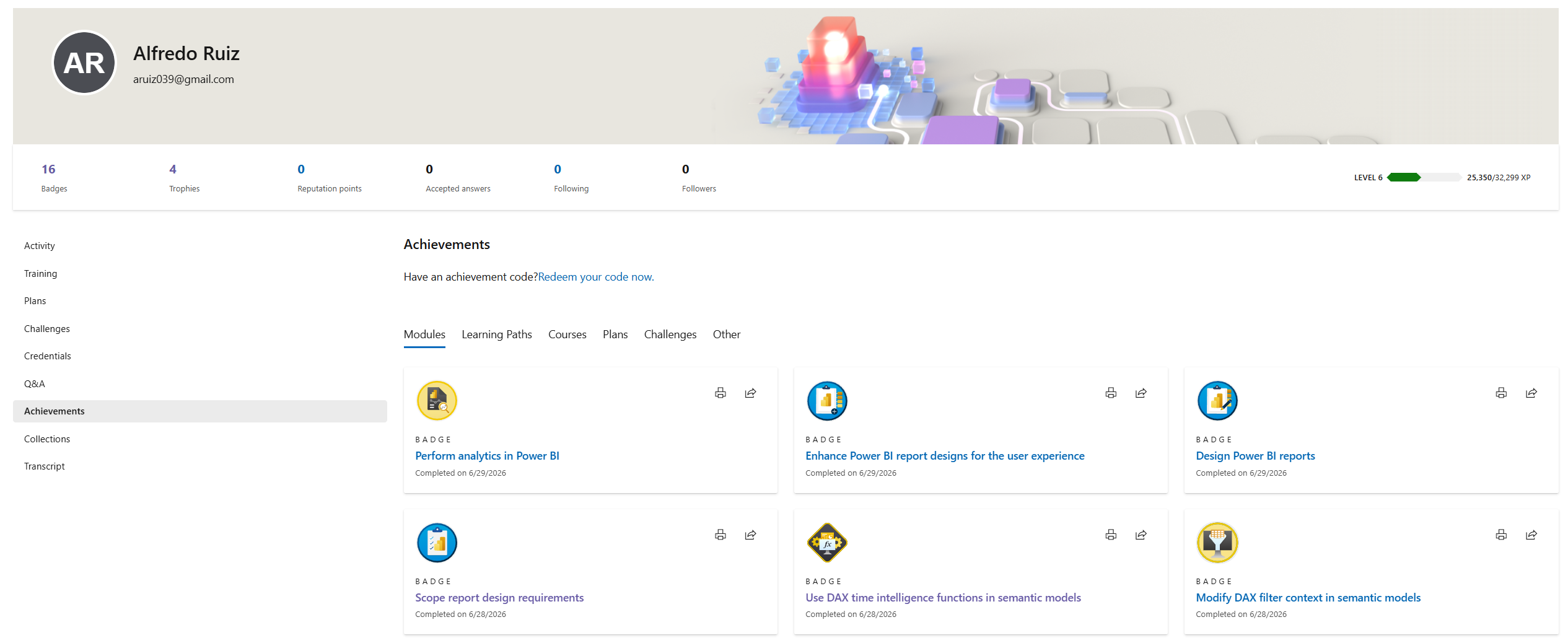
I picked up some nice achievements along the way.
From there I moved into the hands-on work by creating a project where I put it all together. I cleaned data in the Power Query Editor, which meant making real judgment calls about what data looked correct and what didn’t, rather than just accepting what came in. Mostly this was cleaning up null values in the discount column and replacing them with zero, and labeling channels as “Unknown” where they were blank. When cleaning data, errors and blank spaces are what you want to avoid.
Next I connected the tables of my semantic model together in the Model view. If you have ever worked with databases, this is similar to how you relate tables in a join by primary key.
Then I configured the dashboard boxes on my page one by one, which is all about formatting and having an eye for the user’s experience. By the end I had built a dashboard that behaves like a web app.
One thing I found interesting is how much Power BI sits at the intersection of art, math, and configuration. The math and setup have clear right answers, but the visual design side, once you get to dashboards, is something you have to develop a feel for.
Here is the base dashboard I built. Feel free to click around in it.
I think i got through a worthwhile exercise and i hope the thoughts i noted down helps someone else think about how to take on projects.